Revamp Analytics in Showpad
I redesigned the Analytics experience for Showpad, addressing usability issues and enhancing personalization, which led to a 20% increase in adoption rates and significantly improved user satisfaction.
Industry
Tech Sales

Role
Lead Product Designer
Contribution
User Insights Gathering, Developer Partnership, Ideation, Testing
Value
Customer-centric, Interdisciplinary teamwork, Insight-led strategy

Before

After

Challenge
The analytics feature faced several challenges, including an inconsistent UI due to the integration of Amazon QuickSight, which didn’t align well with our design system. This resulted in a fragmented and outdated experience for users. Additionally, the poor navigation made it difficult for users to find relevant data or reports, further hindering engagement.
The traditional and clunky look of the interface made the feature less visually appealing and harder to use, limiting its effectiveness and adoption. Addressing these issues required extensive collaboration with front-end developers to ensure the design was not only visually cohesive but also technically feasible.
Low adoption rates stemmed from a poor user experience, limiting engagement and hindering its value for decision-making. The prebuilt reports were ineffective, as they didn’t align with user needs, lacking customization and actionable insights, which resulted in missed opportunities.
Additionally, the redesign was based on assumptions rather than user-centered insights, highlighting the need for thorough user research and validation to drive the project’s success.
Business POV
“Leverage user insights to transform the analytics experience into an intuitive, engaging, and data-driven tool”
Process & Approach
The research phase involved conducting over 20 user interviews with stakeholders and end-users across various departments. These interviews helped uncover key pain points such as poor navigation, confusion around finding reports, and frustration with the outdated UI.
To gain a deeper understanding of usage patterns, I used analytics tools like Pendo to analyze metrics and identify trends, focusing on areas with the lowest engagement. This data allowed me to pinpoint the most critical areas that needed improvement. In parallel, I held meetings with business stakeholders to ensure that the goals of the redesign were aligned with broader organizational objectives and user needs.
Methods used:
Customer Interview
Data Analysis
Heuristic Evaluation
Stakeholder Alignment


“Your reporting is clunky. So it does not make it easy for me to do my job”.
“ If I were to download these reports, it would most likely go into presentations where I have to report back to leadership to give them an idea of usage or trends”
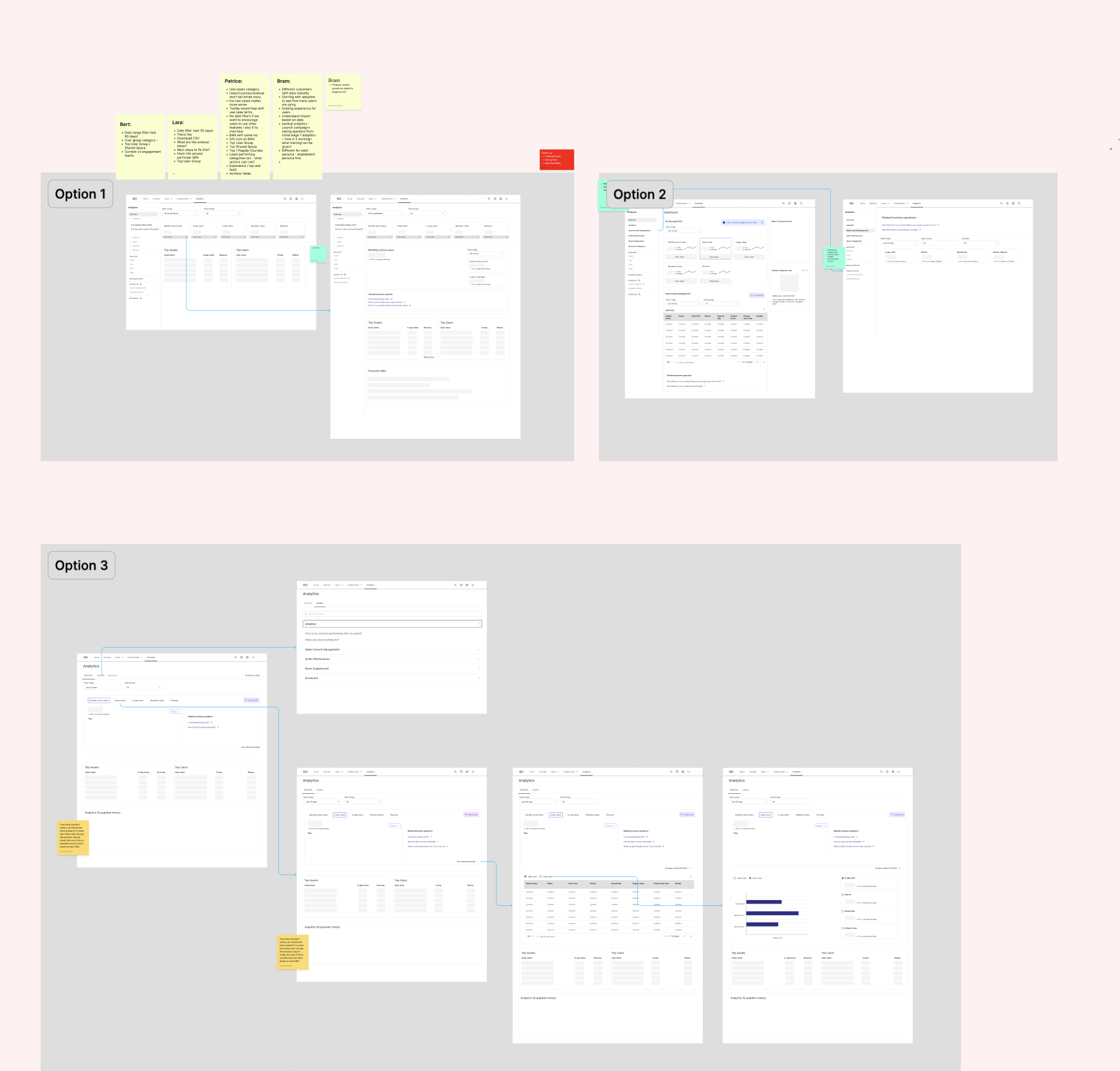
Define & Ideate
I restructured the Information architecture (IA) of the analytics feature to streamline the user journey. By understanding common workflows, I was able to prioritize making key features more accessible, which would improve navigation and allow users to access insights more quickly.
I also created detailed user flows for different tasks such as accessing reports, customizing dashboards, and sharing insights. This ensured that each user journey was as efficient and logical as possible, optimizing the overall experience.
Methods used:
Information Architecture
User Flows


Design & Validation
During the design phase, I started by creating low-fidelity wireframes to explore various layout options, then evolved these into high-fidelity prototypes. The prototypes were designed with a modern, visually appealing aesthetic that aligned with Showpad’s brand and design system. While these prototypes were being refined, I conducted multiple rounds of usability testing with both existing and potential users, focusing on navigation, personalization features, and the overall user experience to ensure the design met real-world needs.
However, the most critical aspect of this phase was the collaboration with front-end development. Integrating Amazon QuickSight, our third-party reporting tool, introduced several technical challenges. Frequent and close collaboration with the front-end development team was essential to address these complexities. Together, we worked to ensure the design remained technically feasible and adjusted as needed to accommodate QuickSight’s limitations. This collaboration was invaluable in maintaining design consistency while ensuring the final implementation was both functional and aligned with user expectations, ultimately resulting in a more seamless and effective user experience.
Methods used:
Low fidelity wireframes
User tests
Developers Partnership
Design system
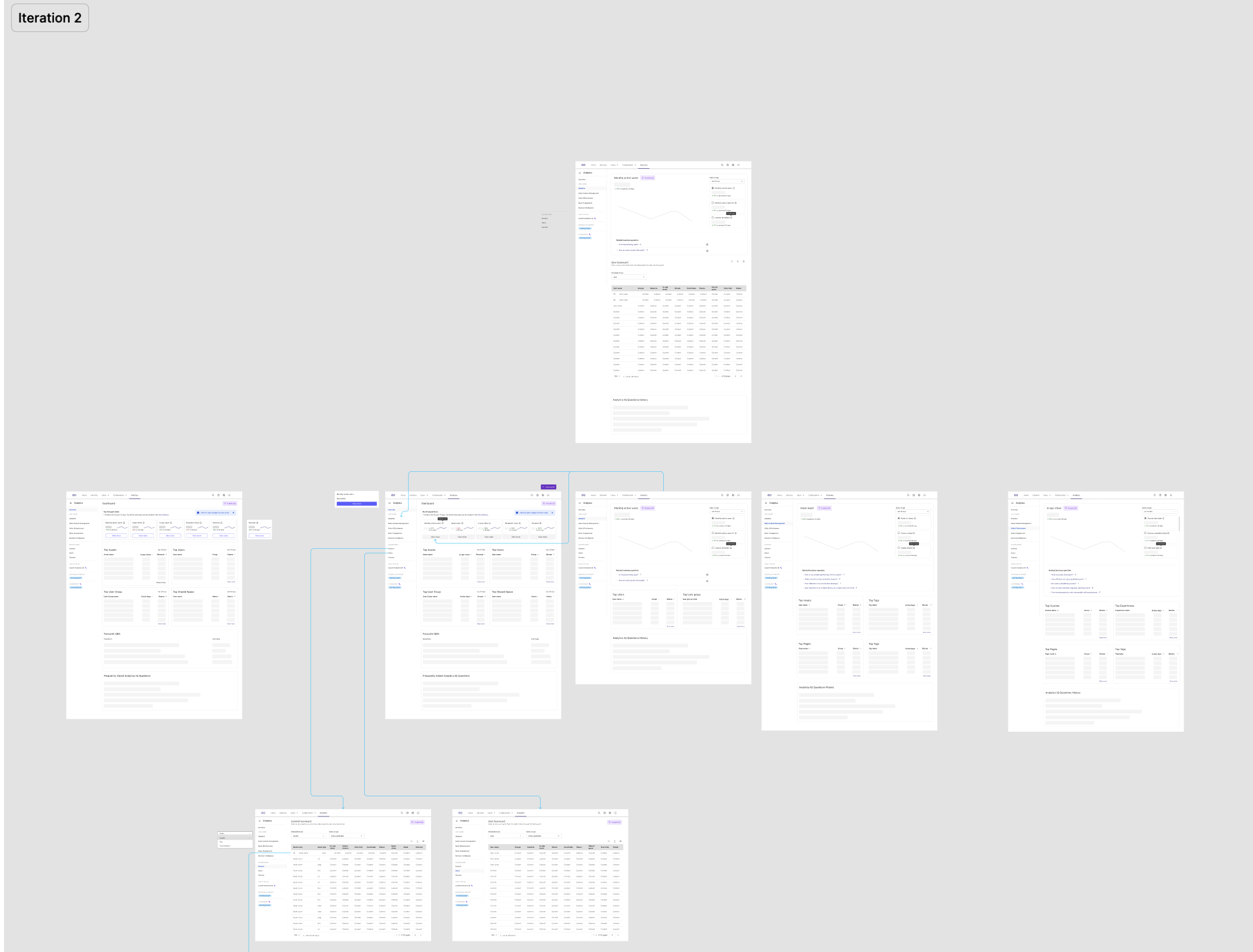
Execution
In the execution phase, I delivered high-fidelity prototypes that were fully annotated with detailed design specifications and assets to ensure a smooth development process. I also conducted extensive usability testing to validate the design and refine it based on user feedback.
A key aspect of the execution was collaborating closely with the front-end development team and the product manager. Together, we sliced up the project into manageable deliverables, aligning on what could be realistically achieved within the first six-week cycle. This close partnership ensured that we remained focused on delivering high-priority features while adhering to timelines and technical constraints. Additionally, I created comprehensive design documentation to guide the front-end developers, ensuring the implementation adhered to the design system and user expectations.
Methods used:
High-fidelity prototypes
Usability testing
Front-end development collaboration
Design documentation
Design system alignment


Outcome and Impact
20%
Post-launch analytics adoption
30+
interviews and insights that laid the foundation for the redesign.
8
Concept screens aligned to user needs with AI Integration